

A complete mobile ecommerce optimization checklist can increase your conversion rates by up to 35% within 90 days. This comprehensive 30-point mobile ecommerce optimization checklist covers everything from page speed improvements to checkout streamlining, giving you actionable steps to transform mobile visitors into paying customers immediately.
What You’ll Learn:
- 30 specific optimization points with measurable impact on conversions
- Step-by-step implementation guide that works for any ecommerce platform
- Mobile-first strategies that prioritize user experience over technical complexity
- Conversion rate improvements typically ranging from 15-35% within 3 months
- Cost-effective solutions that don’t require expensive redesigns or development
Quick Facts:
- Time needed: 2-6 weeks for full implementation
- Difficulty level: Beginner to intermediate
- What you need: Access to your website backend, basic analytics tools
- Expected results: 15-35% conversion improvement within 90 days
The Basics: Understanding Mobile Ecommerce Optimization Checklist
Mobile ecommerce optimization means making your online store work perfectly on smartphones and tablets. Think of it like rearranging a physical store layout specifically for customers who are walking through with shopping baskets instead of full-sized carts – everything needs to be more accessible, streamlined, and efficient.
Here’s what that looks like in real life: When someone visits your mobile store, they should be able to find products, read details, and complete purchases without pinching to zoom, struggling with tiny buttons, or waiting for slow pages to load.
The main thing to remember is: Mobile users behave differently than desktop users. They’re often multitasking, have shorter attention spans, and expect immediate results. Your mobile ecommerce optimization checklist should address these specific behaviors.
Why This Mobile Ecommerce Optimization Checklist Matters: The Real Benefits
Mobile commerce now accounts for over 73% of all ecommerce sales globally. This means that without proper mobile optimization, you’re potentially losing 3 out of every 4 customers who could have purchased from you.
Personal Benefits You’ll See:
- Immediate revenue increase from improved mobile conversion rates
- Reduced bounce rates as users find what they need faster
- Higher customer satisfaction leading to repeat purchases and referrals
- Competitive advantage over stores that haven’t optimized for mobile
- Better search engine rankings since Google prioritizes mobile-friendly sites
Think of it like this: Every point on this mobile ecommerce optimization checklist is like removing a small barrier between your customer and their purchase. Remove enough barriers, and sales will flow naturally.
Complete Mobile Ecommerce Optimization Checklist: 30 Essential Points
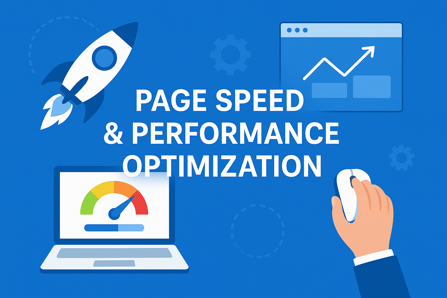
Page Speed & Performance Optimization
1. Target Page Load Speed Under 3 Seconds
- Test your current speed using Google PageSpeed Insights
- Aim for loading times under 3 seconds (1-2 seconds is ideal)
- Pro Tip: Every second of delay reduces conversions by approximately 7%
2. Optimize Images for Mobile Devices
- Compress images without losing quality (use tools like TinyPNG)
- Implement WebP format for faster loading
- Use appropriate image sizes (avoid loading desktop-sized images on mobile)
3. Enable Browser Caching
- Set up caching for static resources (CSS, JavaScript, images)
- Configure cache expiration dates for better repeat visit performance
- Watch Out For: Don’t cache dynamic content like shopping cart contents
4. Minimize HTTP Requests
- Combine CSS and JavaScript files where possible
- Use CSS sprites for multiple small images
- Remove unnecessary plugins and external scripts
5. Implement Content Delivery Network (CDN)
- Use services like Cloudflare or Amazon CloudFront
- Serve content from locations closer to your users
- Significantly improves loading times for global customers
User Interface & Navigation
6. Design Touch-Friendly Navigation
- Make buttons at least 44×44 pixels (Apple’s recommended minimum)
- Ensure adequate spacing between clickable elements
- Use thumb-friendly placement for important actions
7. Simplify Main Navigation Menu
- Limit main menu items to 5-7 categories maximum
- Use clear, descriptive labels instead of creative terminology
- Implement expandable sub-menus that work well on touch screens
8. Create Prominent Search Functionality
- Make search box easily visible without scrolling
- Size search box at least 43 pixels high for easy tapping
- Include auto-complete and search suggestions
9. Implement Breadcrumb Navigation
- Show users exactly where they are in your site structure
- Make breadcrumbs clickable for easy backtracking
- Keep breadcrumb text concise but descriptive
10. Design Intuitive Category Filtering
- Place filter options prominently at the top of category pages
- Use clear icons and labels for filter types
- Allow users to see and easily remove applied filters
Product Pages & Information
11. Optimize Product Image Display
- Enable pinch-to-zoom for detailed product views
- Use high-quality images that load quickly
- Include multiple angles and lifestyle shots
12. Write Mobile-Optimized Product Descriptions
- Keep key information “above the fold”
- Use bullet points for easy scanning
- Include essential details first (price, availability, key features)
13. Display Clear Pricing and Availability
- Make price prominently visible and easy to read
- Show stock availability immediately
- Include any shipping costs or restrictions upfront
14. Add Customer Reviews and Ratings
- Display star ratings prominently near product titles
- Show review counts to indicate social proof
- Make reviews easily accessible but not overwhelming
15. Include Size Guides and Specifications
- Create mobile-friendly size charts
- Use expandable sections for detailed specifications
- Include helpful measurement guides where relevant
Shopping Cart & Checkout Process
16. Create Persistent Shopping Cart Access
- Keep cart icon visible on all pages
- Show cart quantity badge for easy reference
- Allow easy cart editing without leaving current page
17. Design Single-Page Checkout Flow
- Minimize steps between cart and purchase completion
- Use progress indicators to show checkout stages
- Eliminate unnecessary form fields
18. Optimize Form Fields for Mobile
- Use appropriate keyboard types for each field (numeric for phone numbers)
- Implement auto-fill capabilities
- Make form fields large enough for easy typing
19. Offer Guest Checkout Option
- Allow purchases without account creation
- Make account creation optional and explain benefits clearly
- Streamline the entire checkout process
20. Display Security and Trust Signals
- Show SSL certificates and security badges prominently
- Include trusted payment method logos
- Display return policy and customer service contact information
Payment & Security Features
21. Support Multiple Payment Methods
- Include popular mobile payment options (Apple Pay, Google Pay)
- Offer traditional methods (credit cards, PayPal)
- Clearly display accepted payment types before checkout
22. Implement One-Click Payment Options
- Enable saved payment methods for returning customers
- Use secure token-based payment storage
- Make one-click purchasing prominent but not accidental
23. Ensure PCI Compliance and Security
- Use secure payment processing systems
- Display security certifications clearly
- Never store sensitive payment information locally
24. Create Mobile-Friendly Error Handling
- Show clear, helpful error messages
- Highlight exactly which fields need correction
- Provide suggestions for fixing common errors
User Experience Enhancements
25. Implement Smart Search Features
- Include typo tolerance in search functionality
- Show relevant results even for misspelled queries
- Add visual search capabilities where appropriate
26. Design Responsive Customer Support
- Include easily accessible chat or contact options
- Create mobile-friendly FAQ sections
- Offer callback options for complex issues
27. Add Social Proof Elements
- Display recent purchases or popular products
- Show customer testimonials prominently
- Include social media integration where relevant
28. Create Personalization Features
- Show recently viewed products
- Recommend related or complementary items
- Remember user preferences and shopping behavior
Technical & Analytics Optimization
29. Set Up Mobile-Specific Analytics
- Track mobile-specific conversion funnels
- Monitor mobile bounce rates and user behavior
- Set up goals for mobile commerce success
30. Conduct Regular Mobile Testing
- Test on actual mobile devices regularly
- Use tools like Google’s Mobile-Friendly Test
- Gather feedback from real mobile users
Advanced Mobile Ecommerce Optimization Checklist Tips
For readers ready for more depth: Once you’ve implemented the basic 30-point mobile ecommerce optimization checklist, consider these advanced strategies:
- Progressive Web App (PWA) implementation for app-like mobile experiences
- Accelerated Mobile Pages (AMP) for lightning-fast product pages
- Voice search optimization for emerging search behaviors
- AI-powered personalization based on mobile user behavior patterns
Common Mistakes to Avoid in Mobile Ecommerce Optimization
1. Ignoring Touch Screen Behavior Many store owners simply shrink their desktop site instead of redesigning for touch interaction. This leads to frustrated users who can’t easily tap buttons or navigate menus.
2. Overwhelming Mobile Users with Information Desktop users can handle more complex layouts, but mobile users need simplified, focused experiences. Don’t try to cram everything from your desktop site onto mobile screens.
3. Neglecting Mobile-Specific Testing Testing only on desktop or using browser mobile simulators isn’t enough. Real device testing reveals issues that simulations miss.
4. Making Checkout Too Complicated Mobile users abandon carts quickly when checkout processes are lengthy or confusing. Every extra step significantly reduces conversion rates.
5. Forgetting About Mobile Loading Speeds
Mobile internet connections are often slower and less reliable than desktop connections. What loads quickly on desktop might be painfully slow on mobile.
Frequently Asked Questions About Mobile Ecommerce Optimization Checklist
What if I’m completely new to mobile ecommerce optimization? Start with the first 10 points on this mobile ecommerce optimization checklist, focusing on page speed and navigation improvements. These provide the biggest impact with relatively simple implementation. You don’t need technical expertise to begin – many of these optimizations can be handled through your ecommerce platform’s settings.
How long does it typically take to see results from mobile optimization? Most businesses see initial improvements within 2-3 weeks of implementing basic mobile ecommerce optimization checklist items. Significant conversion rate improvements usually appear within 60-90 days of completing the full checklist. Page speed improvements show immediate results, while user experience enhancements take longer to impact overall metrics.
What are the most common problems when implementing mobile optimization? The biggest challenges include: making buttons too small for touch interaction, creating overly complex navigation menus, and underestimating mobile loading time requirements. Also, many businesses focus only on visual appearance while ignoring functional usability on touch devices.
Do I need any special tools or skills to use this mobile ecommerce optimization checklist? Most items on this mobile ecommerce optimization checklist can be implemented using standard ecommerce platform features or simple tools. You’ll need basic access to your website’s admin area and free tools like Google PageSpeed Insights for testing. More advanced items might require developer assistance, but the majority can be handled by business owners.
How do I know if my mobile optimization efforts are working? Track these key metrics: mobile conversion rates, mobile bounce rates, page loading speeds, and mobile-specific sales revenue. Set up Google Analytics goals specifically for mobile users and monitor improvements over time. Most businesses see 15-35% improvement in mobile conversions within 90 days.
What should I do if something goes wrong during optimization? Always backup your website before making changes. Test modifications on a staging site first if possible. If you encounter issues, most ecommerce platforms have support resources and community forums. Consider hiring a professional for complex technical implementations if you’re uncomfortable making changes yourself.
Where can I get more help with mobile ecommerce optimization? Your ecommerce platform’s support documentation is the best starting place. Additionally, Google’s Mobile-Friendly Testing tools provide specific guidance, and professional ecommerce consultants can help with complex implementations. Many platform-specific Facebook groups and forums offer peer support.
Conclusion & Next Steps: Implementing Your Mobile Ecommerce Optimization Checklist
This comprehensive mobile ecommerce optimization checklist gives you everything needed to transform your mobile shopping experience and significantly boost conversions. By focusing on user-centered improvements rather than just technical fixes, you’re building a mobile store that customers actually enjoy using.
Start with these immediate actions:
- Test your current mobile site speed using Google PageSpeed Insights
- Review your mobile navigation and checkout process on an actual smartphone
- Identify the top 5 items from this mobile ecommerce optimization checklist that will have the biggest impact on your specific store
- Create a 30-day implementation plan, tackling 1-2 optimization points per week
Remember, mobile ecommerce optimization is an ongoing process, not a one-time fix. Regular testing and gradual improvements will yield the best long-term results.
Ready to Get Started? Pick the first three items from this mobile ecommerce optimization checklist that seem most relevant to your current mobile site issues. Implement these changes over the next week, then measure the results before moving on to the next set of optimizations.
Transform Your Mobile Store Today – Your customers are waiting for a mobile experience that makes purchasing effortless and enjoyable.


Comments (0)